Yotel
Strategy
Strategy
Brand Repositioning
Visual Identity System
Illustration, Photography
Copywriting, Marketing
Campaign Creative and Execution
Giving a Category Creator Its Personality Back
Yotel built its name on cleverness — first-class thinking, shrunk to fit a hotel room. Grown into airports, city centers, and long-stay formats across three sub-brands, the wit that built the brand had flattened into the same efficient, design-forward language as everyone else chasing the same guest.
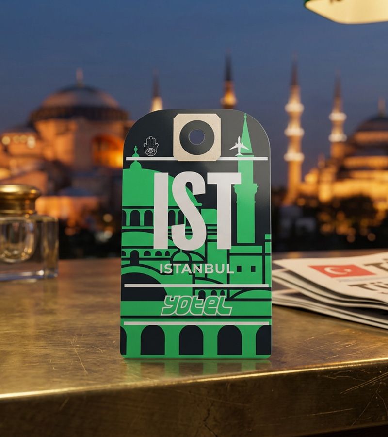
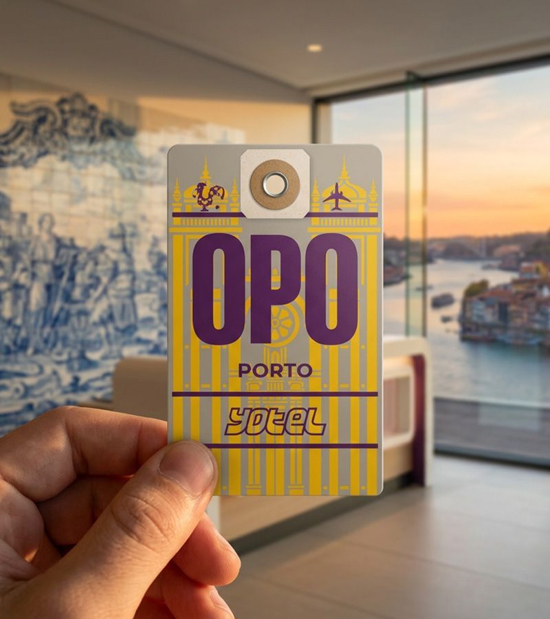
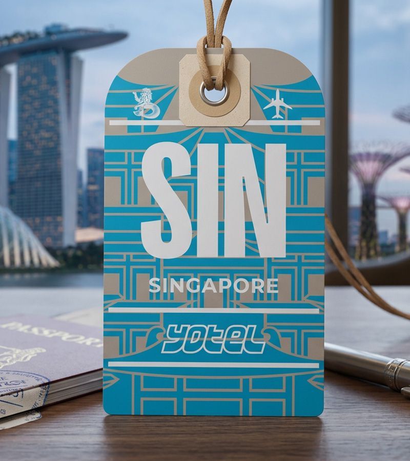
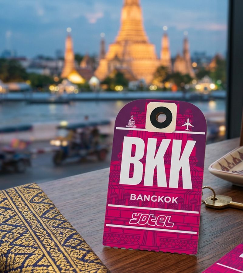
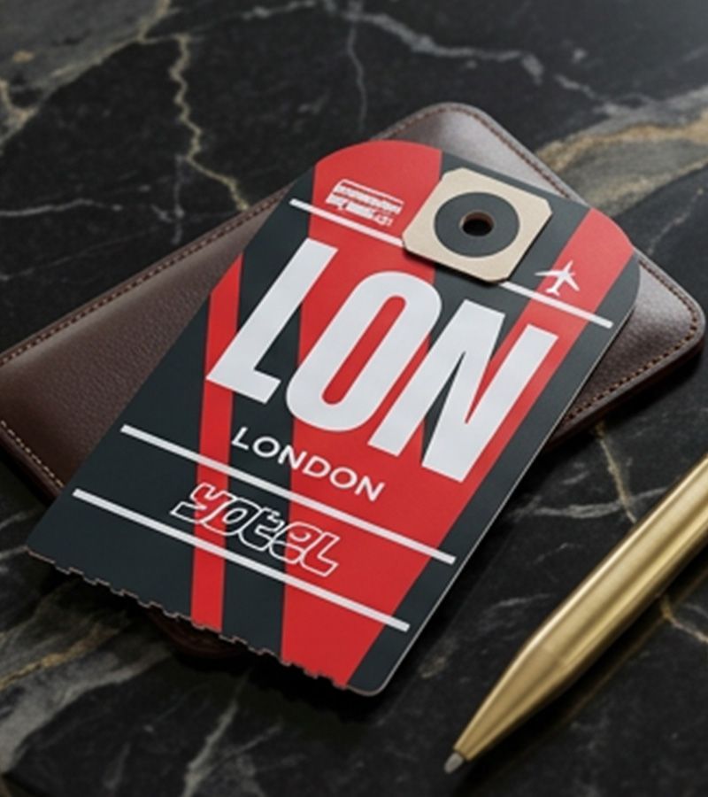
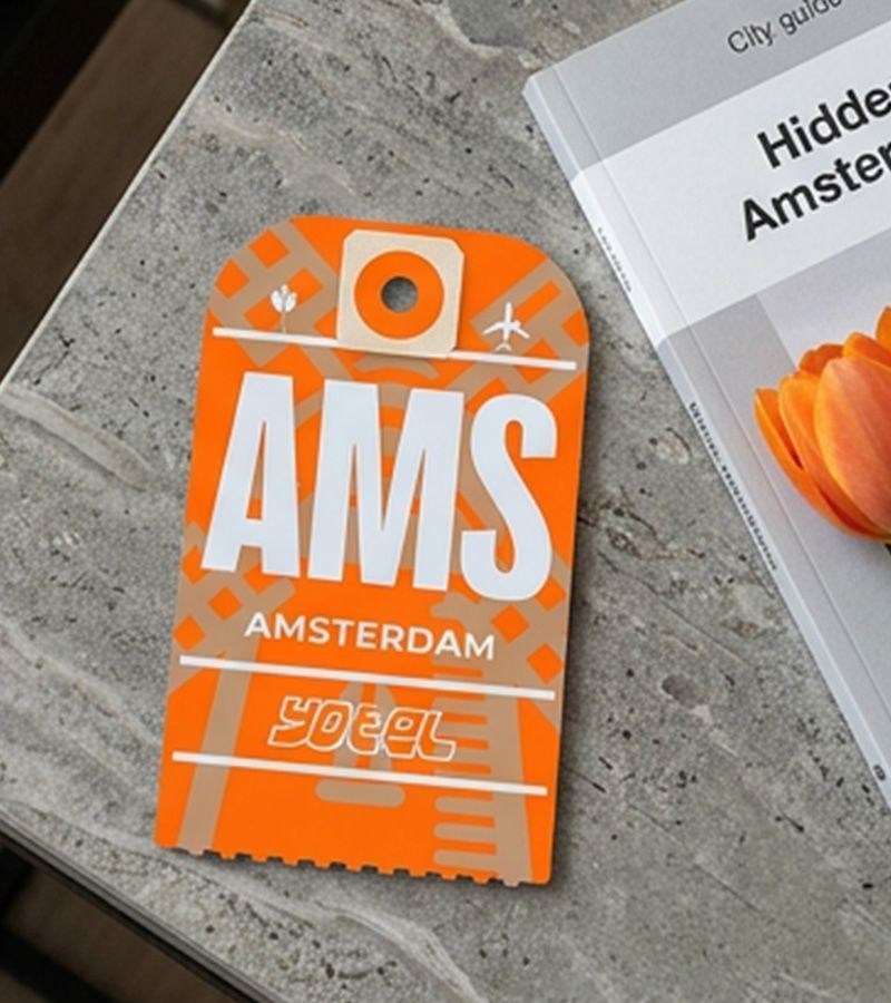
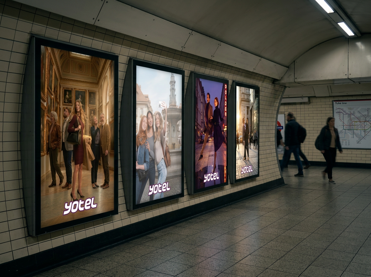
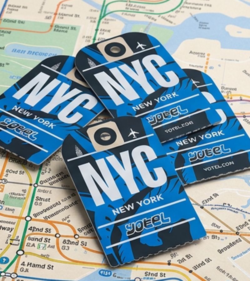
Considered repositioned Yotel around premium-economy hospitality: elevated essentials, fair pricing, a sense of humor intact. We rebuilt the brand architecture — mission, pillars, values, voice — around what Yotel actually gives guests back, which is time, not gadgets. From there, we designed a property-forward identification system starting with key cards: bespoke, city-specific artwork for each property that makes the portfolio's breadth visible at the smallest possible touchpoint and puts some fun back into the brand. We also evolved Yotel's ad campaign, building a new lifestyle concept and directing photography in Geneva around a split-screen signature — the same traveler shown in motion in the city and at rest inside a Yotel, lit in the brand's signature purple haze.
The result is a system built to scale with the brand's own growth without going generic. Every property gets its own key card artwork; every guest still recognizes the brand holding it. A hotel built on cleverness looks like it again.